An Unscientific Comparison of News Websites - Part 1 (Motivation and Methodology)
13 Mar 2021 critique · journalism · media · newsThis series of posts looks at 13 news website home pages and compares them at a single point in time based on the content that they host and the presentation of that content to the common user. This is the first of three posts for this series. It explains my motivation and the methodology that I used for this comparison. I took screenshots of the above-the-fold content on 13 popular news websites at a single point in time. Then, I counted the total number of news articles on each site and classified each one into various categories. I also did a subjective analysis of the site’s look and feel by ranking them between 1 and 10 on 4 metrics (I came up with these metrics using my expectations from news websites as a guide). Once again, this is an unscientific comparison study.
Programming note: (Post 1: Current post, Post 2: March 14, Post 3: March 15)
This is a series of 3 posts. This is the first post in the series. The other two posts will be released tomorrow (March 14th) and the day after (March 15th).
- Motivation and Methodology (this post, released March 13th)
- Objective analysis: Results and Insights (March 14th)
- Subjective analysis: Results and Insights (March 15th)
Motivation
I have been visiting a few news websites regularly for the past 3-4 years. The New York Times website was the first one I started visiting regularly, after subscribing to the “Daily Briefing” email and finding interesting articles on it almost everyday. With the rise of podcasts, I come across new articles that authors and hosts talk about on podcasts, which in turn introduces me to new news websites (that is how I found out about FiveThirtyEight). Some websites are very good and I return to them often; others, not so much. This gave rise to the key question that this analysis tries to answer: What makes a news website good and worth returning to?
I think there are two parts to the answer.
First, at considerable risk of stating the obvious, the website should contain factual, reported, interesting news content. I add the epithet “interesting” here because news websites are not wire services (like Reuters or the Associated Press) which simply report the latest fact without any context. They serve the role of an “intelligent aggregator” sitting between the primary source of information (wire service, polling company or research paper) and the layperson. Nearly always, the reader will want to be caught up to the information already known and how the information being reported affects the story (Note that I saw “nearly always” here because some of the stories need little context. On the 2021-03-13, everyone in the world knows about COVID19 and hence one needs little or no context in a story that explains a new vaccine development). Sometimes, the layperson might want to dig further into a topic, the website should encourage and facilitate this desire.
Second, the website should present content in a pleasing, easy-to-read manner. This is clearly subjective: one person’s easy-to-consume is another person’s bland or unimaginative or lazy. Here, I should clarify “easy-to-read” is not talking about the language that is used (e.g. should be at 8th-grade or lower reading level etc). Rather, it denotes the aesthetic presentation of content and the consistency and restraint that the website shows in using technology to deliver news to the user. If there are a huge variety of colors that don’t conform to a single color palette OR if there are multiple fonts on the website, that makes the website less “easy-to-read”. On the other hand, if the website uses one of the standard presentation formats, with a single font and a few meaningful font sizes and has no adhoc elements added for special events, that makes it more “easy-to-read”. To give this series’ readers the utmost flexibility, I have taken care to ensure that the Objective and Subjective analyses are distinct in this series. If your tastes are not in line with mine, please ignore the subjective part of the analysis.
Screenshots
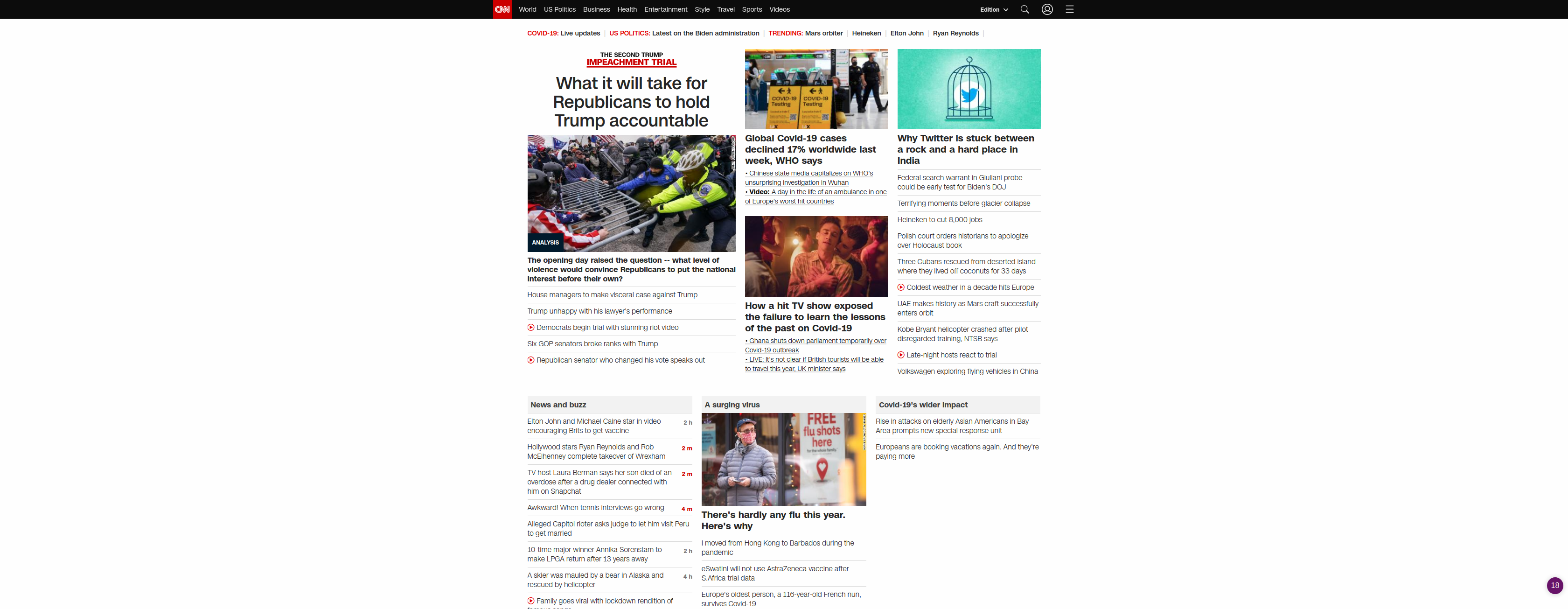
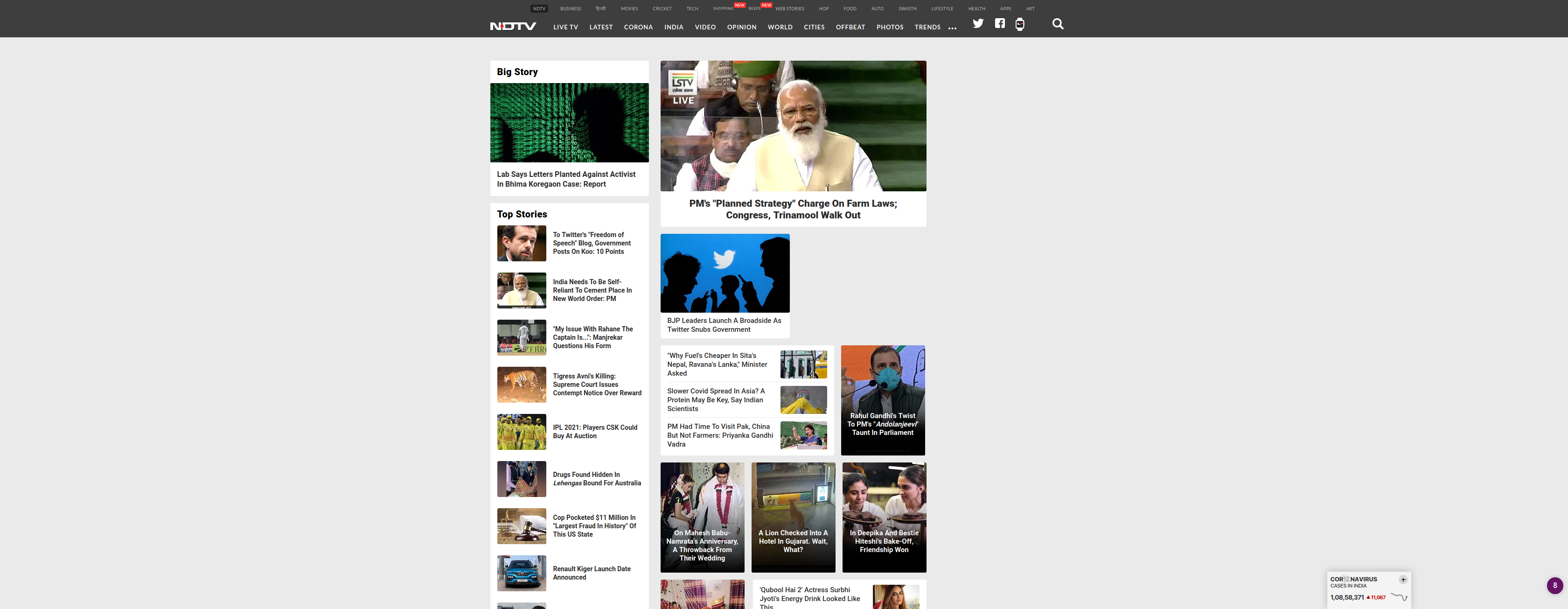
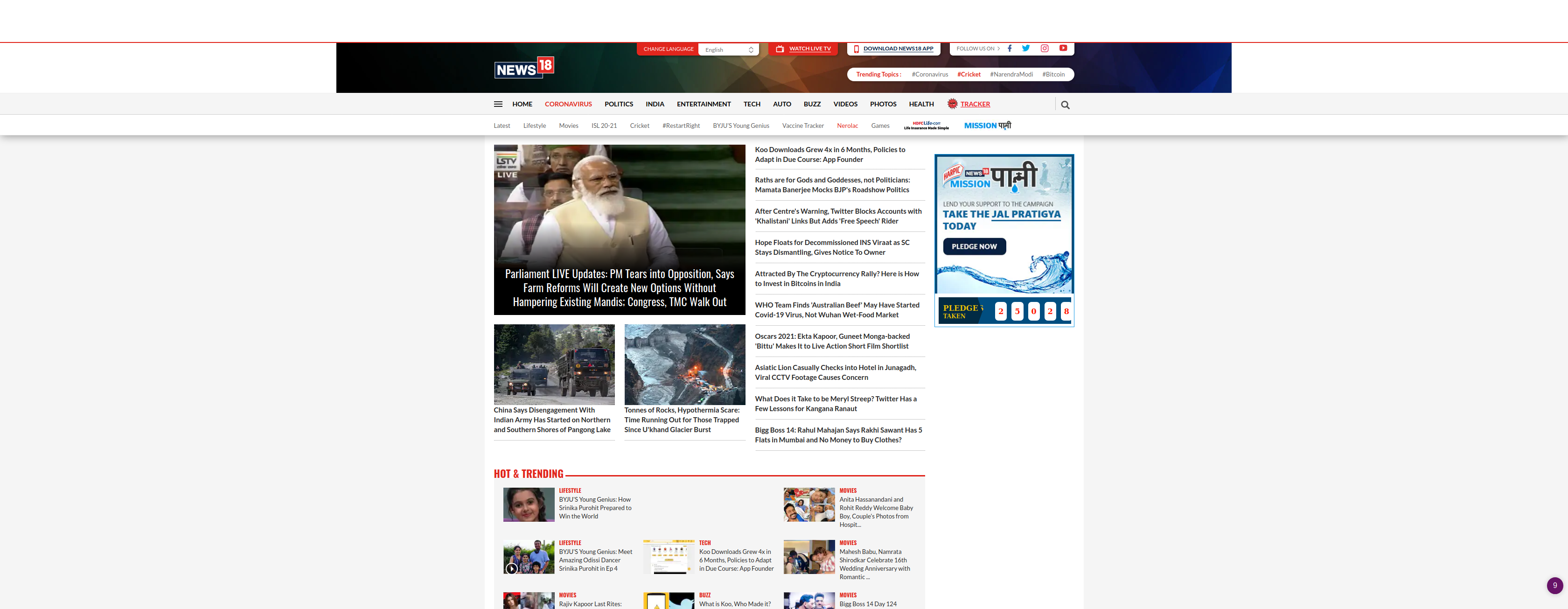
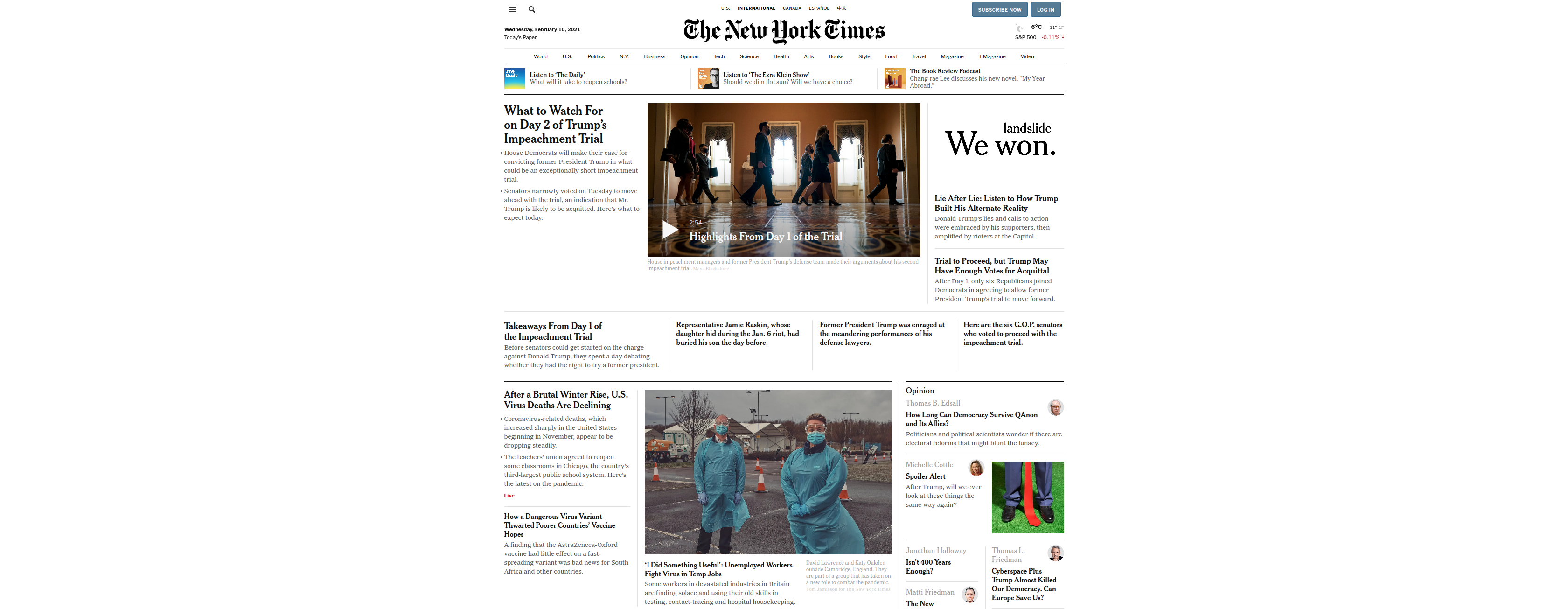
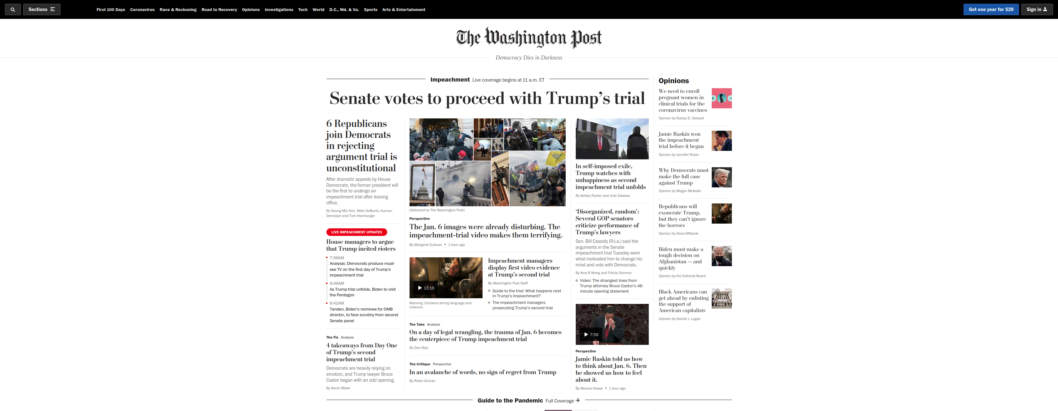
I chose 13 popular news websites and took a screenshot of their home page at 1 pm UTC on 10th February, 2021. I added Vox to the list some time later, so that screenshot was taken at 2 pm UTC on 7th March, 2021.
- The screenshots were taken on a sufficiently wide screen, which ensured that most websites didn’t use all the horizontal space available
- I opened the websites on Firefox with the Ublock extension for blocking ads and the Ghostery extension for blocking analytics enabled
- I didn’t look at any “popular website” ranking to arrive at this list and simply chose the top websites that were at the top of my mind when I thought of “news website comparison”
- You can check the screenshots that I took through the Screenshot column in the following table
- I have inadvertently included an almost identical number of American and Indian websites
| News website | Country | Type of organization | Screenshot |
|---|---|---|---|
| Bloomberg | US | Large, traditional | Image |
| CNN | US | Large, traditional | Image |
| NDTV | India | Traditional | Image |
| News18 | India | Traditional | Image |
| Newslaundry | India | New-age | Image |
| New York Times | US | Traditional | Image |
| Republic TV | India | New-age | Image |
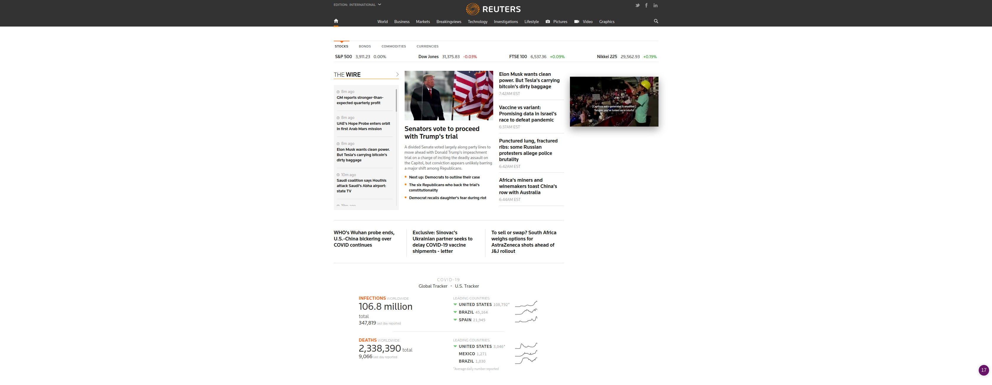
| Reuters | US | Wire service | Image |
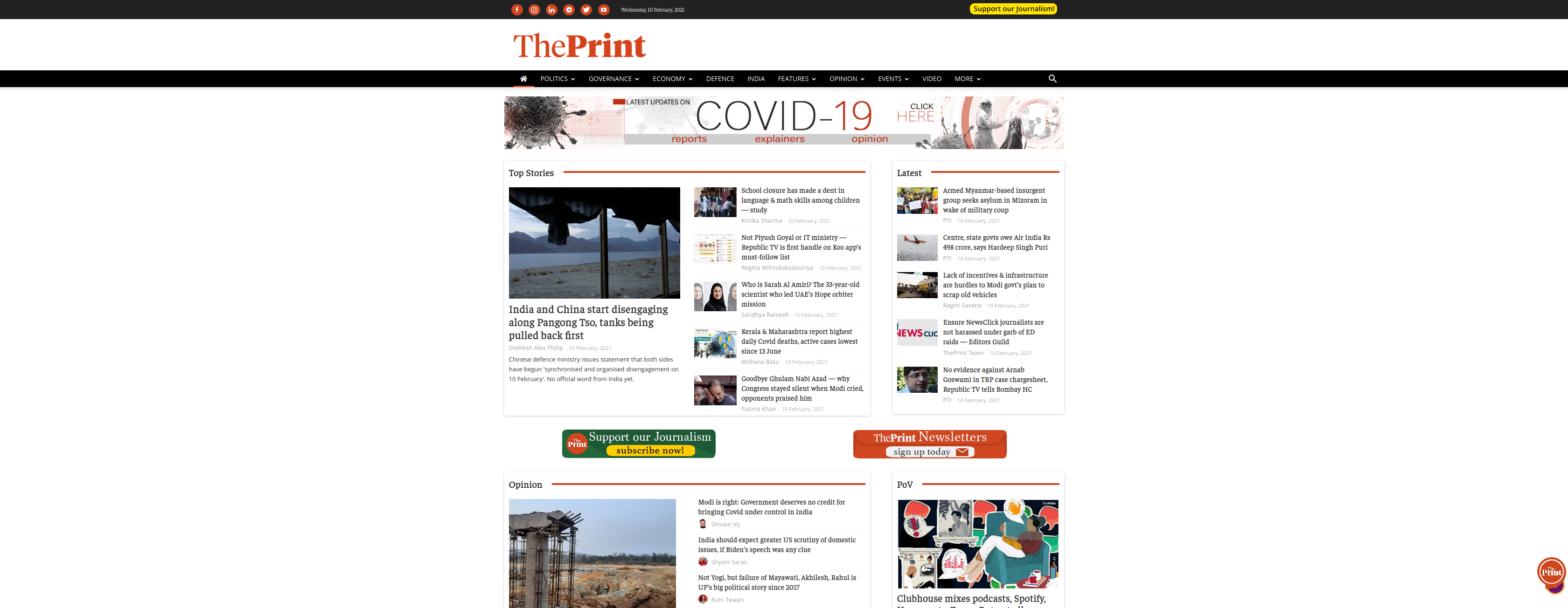
| The Print | India | New-age | Image |
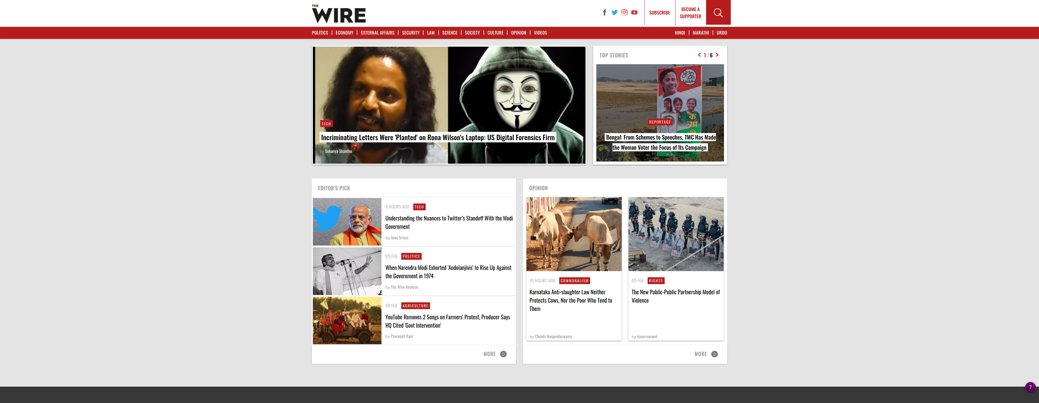
| The Wire | India | New-age | Image |
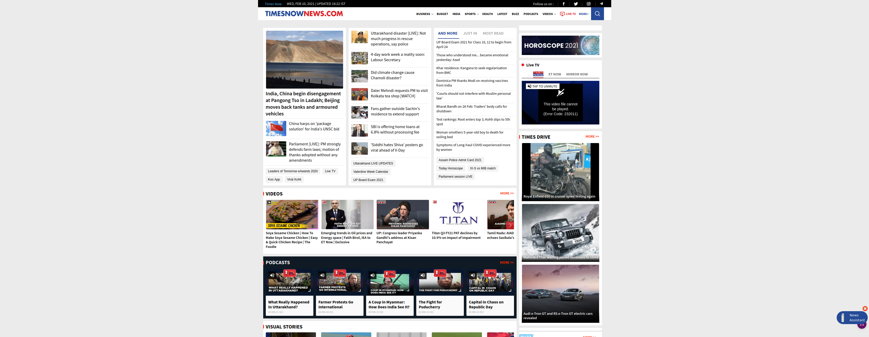
| Times Now | India | Traditional | Image |
| Vox | US | New-age | Image |
| Washington Post | US | Large, traditional | Image |
Traditional news organizations are the ones that have been around for a relatively long period of time and have an approach to news that has remained largely unchanged for the past 40-50 years, even as the medium for delivery might have changed considerably. The New York Times and Washington Post are the stalwarts in this section.
New-age news organizations are those that don’t depend on traditional funding patterns of news (e.g. advertisements, product placements), instead choosing to sell subscriptions or taking a radically different approach to monetization (e.g. partnership with companies like Netflix). Vox is the flag holder for this group.
I have also included 2 Indian websites, Republic TV and Times Now, which are generally known for their entertainment-disguised-as-journalism approach to the nightly news. I wanted to see if these had bad websites or if their TV production was more sensational by some basic necessity of that medium. I found some interesting results; particularly with Times Now which ranked high due to meaningful news on the website and hardly any clickbait stories (This points to the remote possibility that their production team for TV news is doing sensationalist journalism and that is not representative of their newsroom).
Objective analysis: Count and classify
To analyze these sites objectively, I counted the total number of News stories on each website and classified each one into one of the following 8 categories:
- Domestic
- International
- Government
- Economy
- Sports
- Entertainment
- Clickbait
- Other
“Domestic” refers to the country of origin for each news organization. i.e. the same article about a policy decision from the Indian government will be classified as “Government” for NDTV whereas it will be classified as “International” for Bloomberg.
“Entertainment” is the section which would contains news about the film industry or celebrities. I have classified news about arts and music into “Other”. This is in line with my own sensibility that the film industry being a relative newcomer to the world of art.
Opinion-pieces and podcasts are classified in the Other section. Some websites have dedicated “Opinion” reporters and they are given prominent positions on their websites (Bloomberg, NYT).
After the counting and the classification, I calculated the weighted score for each website. During this calculation, I gave a negative weight to “Entertainment” (-1) and “Clickbait” (-2) stories as these are (in my opinion) intrusive, don’t serve any clear purpose and don’t educate the user. In particular, stories like this one are objectively bad for the reader, because they serve as a distraction.
As the attentive reader might have noticed, the weighted score doesn’t have any upper limit. Hence, one must resort to subjective comparisons of different parts of the score.
Subjective analysis: Look and feel
To analyze the look and feel of these sites, I scored these websites on a scale of 1-10 on these 4 metrics:
- Clean design
- A widely debated term, getting it right is impossible. As a reference, I believe that the front pages of DuckDuckGo, YouTube, and the repository page of GitHub follow the principles of “Clean design”
- On the other hand, the Booking.com hotel page is a prime example of a utilitarian page which doesn’t adhere to the “Clean design” ideals and crams too much functionality into a single web page (e.g. Learning that a room at this hotel was booked 2 minutes ago helps Booking.com get to the viewers “FOMO” and helps them make a sale; it leaves the viewer in a decidedly worse state when compared to their self before they arrived at this web page as the only two options left to them are to be swindled out of their money or to leaving the page with the anxiety that the room will not be available a few minutes hence)
- Distractions
- Print newspapers are the holy grail: They have distractions in the form of advertisements but these are placed in well-defined blocks and easily skipped / ignored.
- Modern websites have taken to putting up marquees, counters, count-downs to events, interactive graphs, icons and a lot more on their homepages which ostensibly serve to let the viewer know that they are on a “dynamic” website. None of these are related to news in any way, do not make the presentation any better by their conspicuous presence and don’t add any value for the common user
- Useful links to other parts of the site
- News home pages should serve as jumping off points which can be used by readers to reach other parts of the site that they are interested in. If the website doesn’t provide this functionality, then people will have to use external search engines
- On a philosophical level, the lack of useful links on the home page indicates at a low expectation of longevity from each viewer
- Non-news calls-to-action
- Things that lead to affliate websites, ads, other websites run by the same company, CTAs that go to social media etc are non-news CTAs
- The “Subscribe” CTA is a key part of the website and I don’t consider that a non-news CTA if the news organization runs on the subscription model
In each case, 1 is bad and 10 is good. i.e. 10 denotes extremely clean design, the least amount of distractions, several useful links to other parts of the site and the least amount of non-news CTAs. This part of the analysis gives us a score between 4 and 40 for each website. This score tells us how good the website feels to a user who has the same expectations from news websites as my own
Note about the scoring: After I completed the scoring, I realized that the scores were on the high end of the spectrum as they varied between 22 and 40, out of a maximum score of 40. This was probably because my scoring was accomodative and I didn’t take a stricter view of the minor quirks in some web pages. A more detailed analysis which looks at each component carefully and preferably done by someone who has real UX and Design experience would lead to a better Subjective analysis. Nevertheless, I decided to go with what I had for this iteration of the analysis.