An Unscientific Comparison of News Websites - Part 3 (Subjective Analysis)
15 Mar 2021 critique · journalism · media · newsThis series of posts looks at 13 news website home pages and compares them at a single point in time based on the content that they choose to host and the presentation of that content to the common user. This is the third post in this series and it looks subjectively at the look and feel of the news articles on each news home page. As I explained in the first post in this series, this part of the analysis is subjective and not based on any standards. I take a free-form “scoring” approach to rank the website on some predefined characteristics and then compare those scores. If your sensibilities do not match my own, this part of the analysis might not hold much value for you.
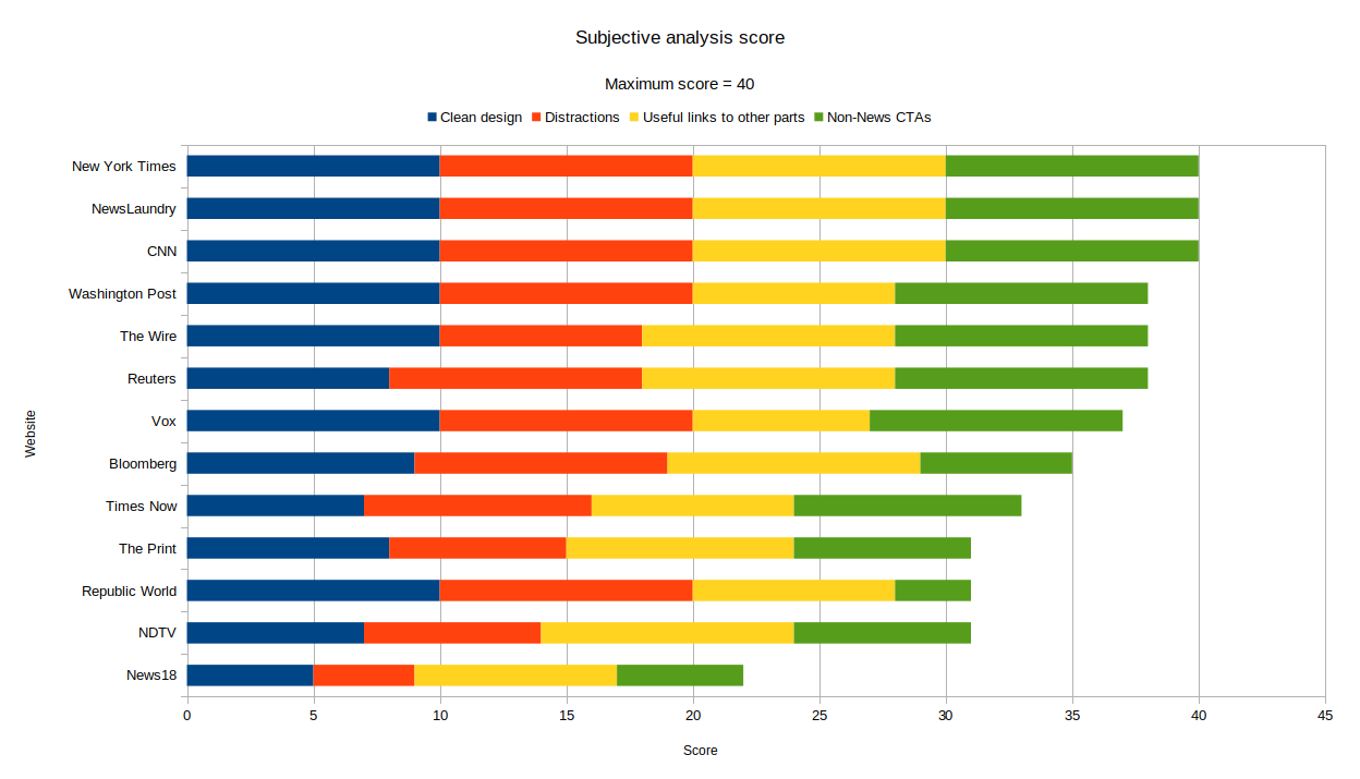
The clean design scoring definitely exposed something that I was vaguely expecting, but couldn’t recognize until I had completed my scoring: It brought the sites I like the most to the top, with some surprising exceptions in the final score.
Non-obscure link names for other parts of the site are important
The surprising exception that came to the top was CNN. I don’t hold any strong opinions about CNN as I don’t frequent the site very often. Looking at the screenshots again, I notice that the website outdoes other websites in the “Useful links to other parts of the site” section. Vox loses on this metric owing to the structure of Vox.com as a series of “verticals”, which are not very closely related to news and can be more accurately described as “Special projects”. (e.g. the effective altruism Vox vertical, Future Perfect).
The internet is powered by linking several other relevant pages on a highly trafficked page. This increases the likelihood of people reaching the homepage through search and then going on to other parts of the site that they find interesting. The Vox method of linking to obscure verticals is sub-optimal from this point of view. On the other hand, smaller websites do this very well. FiveThirtyEight does a very good job in leading people to other parts of the site. They have a simple navigation bar with links that are very vanilla: Politics, Sports, Science, Podcasts, Video. I have used this navigation bar several times, particularly when I want to listen to a podcast or watch something that they recently put out, without any clear expectation of what topic that might be related to. It is hard to argue that “Open Sourced”, “Recode”, “The Goods”, or “Future Perfect” are easier to comprehend. The Print and The Wire, 2 Indian new-age news websites, do a good job at this too, by sticking to traditional News beats for their navigation bar.
Most of the websites are well designed
This is controversial, because it is fashionable to rant about bad design and clutter. My experience with these sites, with Ublock turned on, was pleasant. None of the websites took an inordinate amount of time to load. The worst offenders were sites with moving elements like countdown timers or interactive graphs that don’t add anything useful to the user’s experience. Bloomberg’s ticker is the one element that I haven’t gotten used to despite having used the site for a while now. I am tempted to say that I don’t think it adds value for any kind of user, professional stock broker or otherwise, and that it is a skeuomorphism-based hold-out from the past when displays were too expensive to be large enough to show several stock quotes at once.
News18 was the strangest website on this particular point. More on this later.
Hilariously, Republic World scored a 10/10 on “Clean design” because they chose to put a single embedded video on their website (I was tempted to give them 11 or 15 for their surprising restraint on this absolutely irrelevant point, even as their daily news coverage hovers somewhere between “shouting match” and “I can’t believe this is news”). Of course, the website with the cleanest design is one that is completely empty.
Non-news CTAs are bad for the user
This one is a no-brainer. A news website shouldn’t mess with the reader’s experience with unnecessary ads of campaigns that Indian TV news channels are major sponsors / participants of (NDTV started this practice a few years ago with their “Save the Tiger” campaign which was widely applauded by animal rights activists and became the vogue thing to do if you are a news channel with a meaningful audience). Most of the websites I looked at have the “Subscribe” CTA. Given that these websites have very few avenues of making money if most of their users have ad-blockers installed, this is a necessary evil and must be forgiven by the responsible consumer.
As for links to Twitter / Facebook / foobarbaz, I doubt that these are required. I can find CNN on
Twitter. If I want to mention NDTV on Twitter, I will type @NDTV and select the first suggestion
from Twitter that has the verified check mark. I think most other users will do the same. I doubt
that any Twitter user will go from NDTV.com to Twitter.com/NDTV and then tap on the Tweet button. My
intuition is that at some point in the past, product managers of the NDTV.com website decided to add
these CTAs to their site and that they didn’t run A/B tests to see if these new CTAs drove any
engagement. Removing code is harder than adding it into a large repository, because anything that is
in the repository quickly used in unexpected ways by other developers. This probably
dis-incentivised them from removing these CTAs later (This is all rank speculation, pay no mind to
it).
At last, we come to News18. This is the part of the analysis where I slightly started to lose my patience because News18.com is just not a good place to read anything. It faired poorly in the objective analysis because there was a lot of Clickbait and a lot of Entertainment news. Apart from the News articles, the site has nearly 10 other CTAs. These say things like “Watch Live TV”, “Download News18 App” (inexplicably shown on a desktop browser), “Follow” the site on social media etc. There’s also some sort of campaign that is asking you to take a pledge to save water today. There’s a strange “COVID tracker” where the word “COVID” is replaced by a rendering of the many-pronged “virus”. I seriously hope that you never have to tap on any link that leads you to this homepage, as one can only get more confused from the barrage of irrelevant information that’s presented on it.